What is Eurekly? Eurekly is an all-encompassing educational platform that successfully meets both the demand for multi-disciplinary online learning and for knowledge-based social networking. A marriage, feature-packed, functional and full of empowerment, that encourages and celebrates learning and sharing in a vibrant and evolving online ecosystem.
Eurekly has been designed to connect passionate educators, learners and knowledge sharers of every description and discipline, both professional, academic and private, anywhere in the world, at any time.
The mission is to become the gateway for online education; aggregating online learning and learning-oriented social networking.
Role & Duration
Product UX/UI Designer
Apr 2019 - Nov 2021
Team
– 2 Product Designers
– 2 Product Managers
– Analytical Department
– Marketing Department
– 6 Developers
My role
As a Product Designer, I was involved in every aspect of the product development process: from brainstorming the next innovations on the platform to the final testing of features on the platform.
In more details, I led the following projects:
01
Designing of the range of features from the scratch
02
Creation of an original Design System. This system is the core driver to standardize and harmonize the product design across a range of features and parts of platform.
Subsequently, my design system allowed to speed up the front-end development process by an average of 1 sprint and significantly speed up the design-process of new features and maintaining existing ones.
03
Redesign of the entire product.
Applied skills:
Product design
Usability testing
UX Research
Responsive Design
Wireframing
Prototyping
Design Thinking
User Interview
UX/UI
Below I will demonstrate a few of the projects I’ve been working on in Eurekly
Project Examples
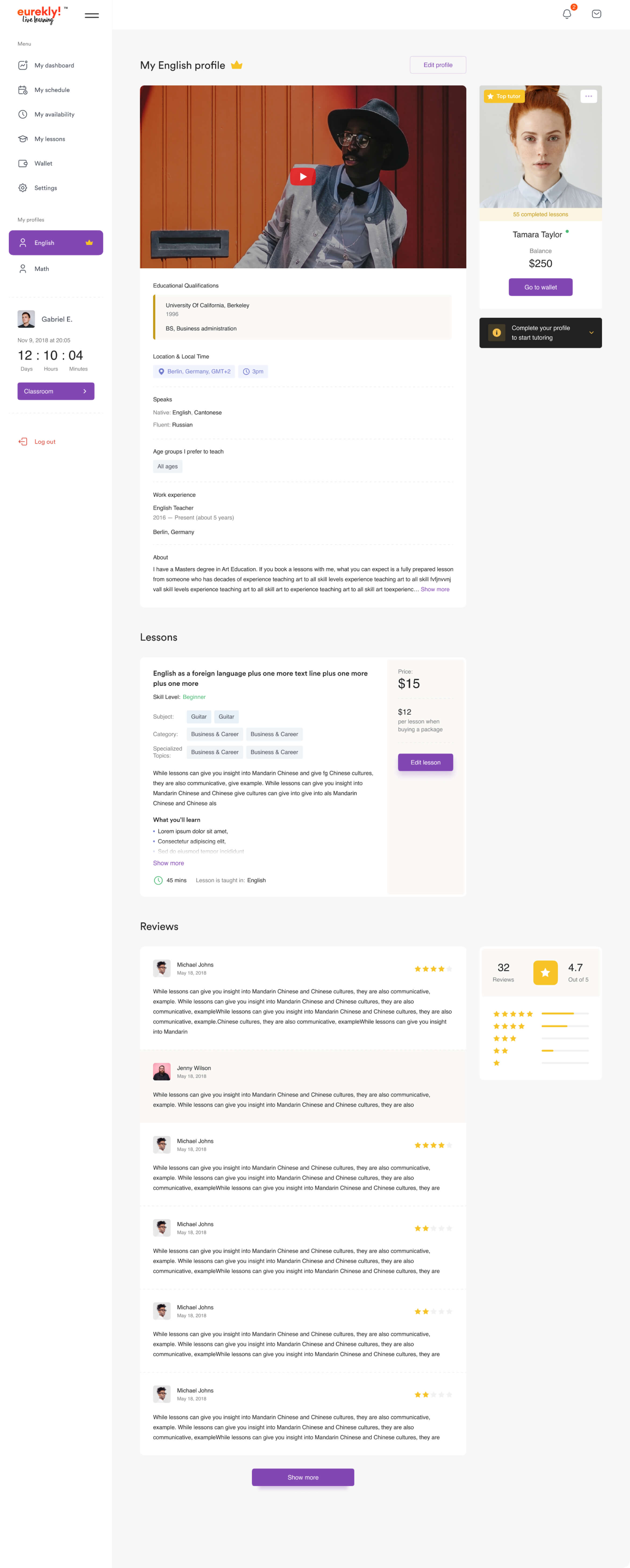
Teacher Profile page
The problem
01
According to the UX research, the platform proved to be highly inconvenient for users due to the old design that jumbled information across all subjects within the teacher's profile. To address this issue, a decision was made to split the teacher's profile into multiple sections, with each section reflecting information specifically related to their experience in a particular subject.
02
The findings of the study revealed that the section on the page featuring teacher posts, despite occupying a significant portion of it, provides no value to users. As a result, it was concluded that the section should be eliminated and replaced with more beneficial content blocks.
03
The current design was also visually complex and challenging to read. Excessive accents and a lack of coherence between content blocks make it difficult for users to find the necessary information about the teacher.
04
The metrics research revealed that the blocks that users most frequently pay attention to are visually overshadowed and not prominent enough. Therefore, a complete restructuring and prioritization of content blocks is needed to improve the page.
Old design
(made by previous designer)
Bad UX
Outdated UI
Complicated and not friendly interface
Research
Expert Interviews
I took a thorough and strategic approach by conducting interviews with representatives from different areas of the organization to gather information about the unique requirements and concerns for the redesign project. This can help ensure that all stakeholders' interests are taken into account and that the final solution is aligned with the overall goals of the company.
User Interviews
I employed a user-centered design approach by conducting multiple user interviews throughout the product's lifecycle. This helped me gather a wealth of information about our users, including their pain points, values
Users say
Oliver Abramson
Tutor
26 y.o.
There are a lot of blocks on the teacher's page that distract attention, it is not clear how and where to fill out the profile
Amanda Haar
Tutor
31 y.o.
It was difficult to figure out where and how to create a lesson, navigation on the site is not convenient
Michael Lettau
Tutor
45 y.o.
Instead of promoting my lesson cards, why do students see my news feed first? Useless UI...
Metrics say
Results of work
01
Research and gathering
I gathered and structured all user feedback from interviews, top management insights, and metrics data. Made CJM and personas cards to better understand our users.
02
Wireframing and design
I went through a thorough process for redesigning the UI and UX of a page, including collaborating with product managers, creating design layouts and a clickable prototype for usability testing.
03
Usability and final design
I conducted usability testing by recruiting 5 participants, preparing scenarios and questions for them, and using their feedback to make final changes to the design.
By the way
Usability testing is a great way to validate the usability of your design and make any necessary adjustments before the final launch.
Final Design
Placed accents
Clean and clear interface
Convenient clear menu
Teacher Profile page
Before
Poor functionality
Outdated design
After
Functionality that covers all the needs of online classes
Overview
What is goLance? GoLance is a broad freelance platform, much like Upwork or Freelancer. Individuals can create a profile on the site, saying what they do and what they charge. Companies can then invite them to bid on projects. Alternatively, the freelancer can seek out work from open projects already posted on the site.
The mission is to create a more meaningful and prosperous working world.
Role & Duration
Product UX/UI Designer
Oct 2021 - Apr 2024
Team
– 1 Product Designer
– 2 UX/UI Designers
– 1 Product Managers
– Analytical Department
– Marketing Department
– 4 Developers
My role
As a product designer, I have been involved in all aspects of the product development process: my team had 2 UX/UI designers to whom I distributed and delegated tasks
In more details, I led the following projects:
01
Designing of the range of features from the scratch
02
Updating the design system and improving it to simplify work
03
Redesign of the entire product.
Applied skills:
Product design
Usability testing
UX Research
Responsive Design
Wireframing
Prototyping
Design Thinking
User Interview
UX/UI
Below I will demonstrate a few of the projects I’ve been working on in goLance
Project Examples
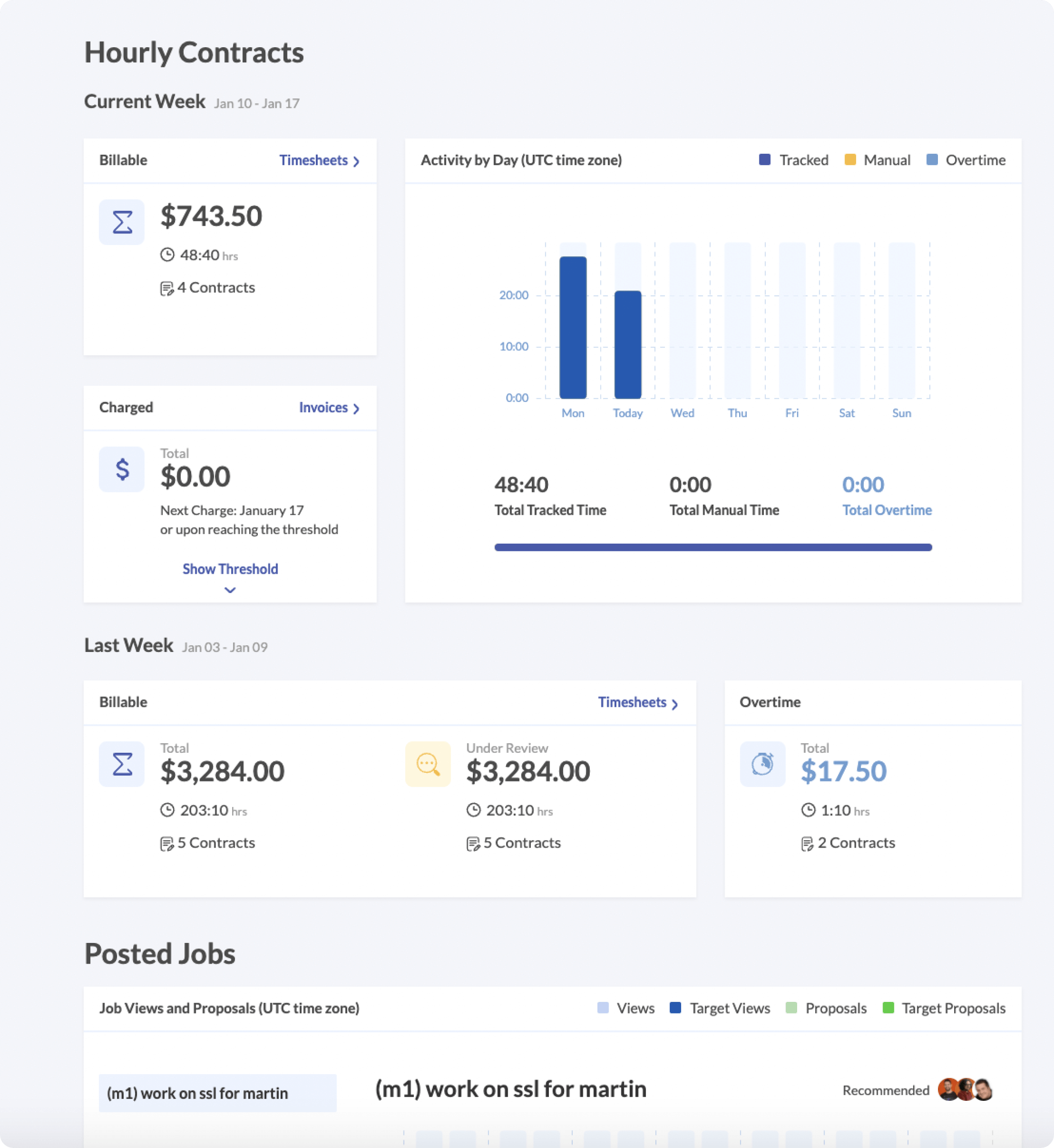
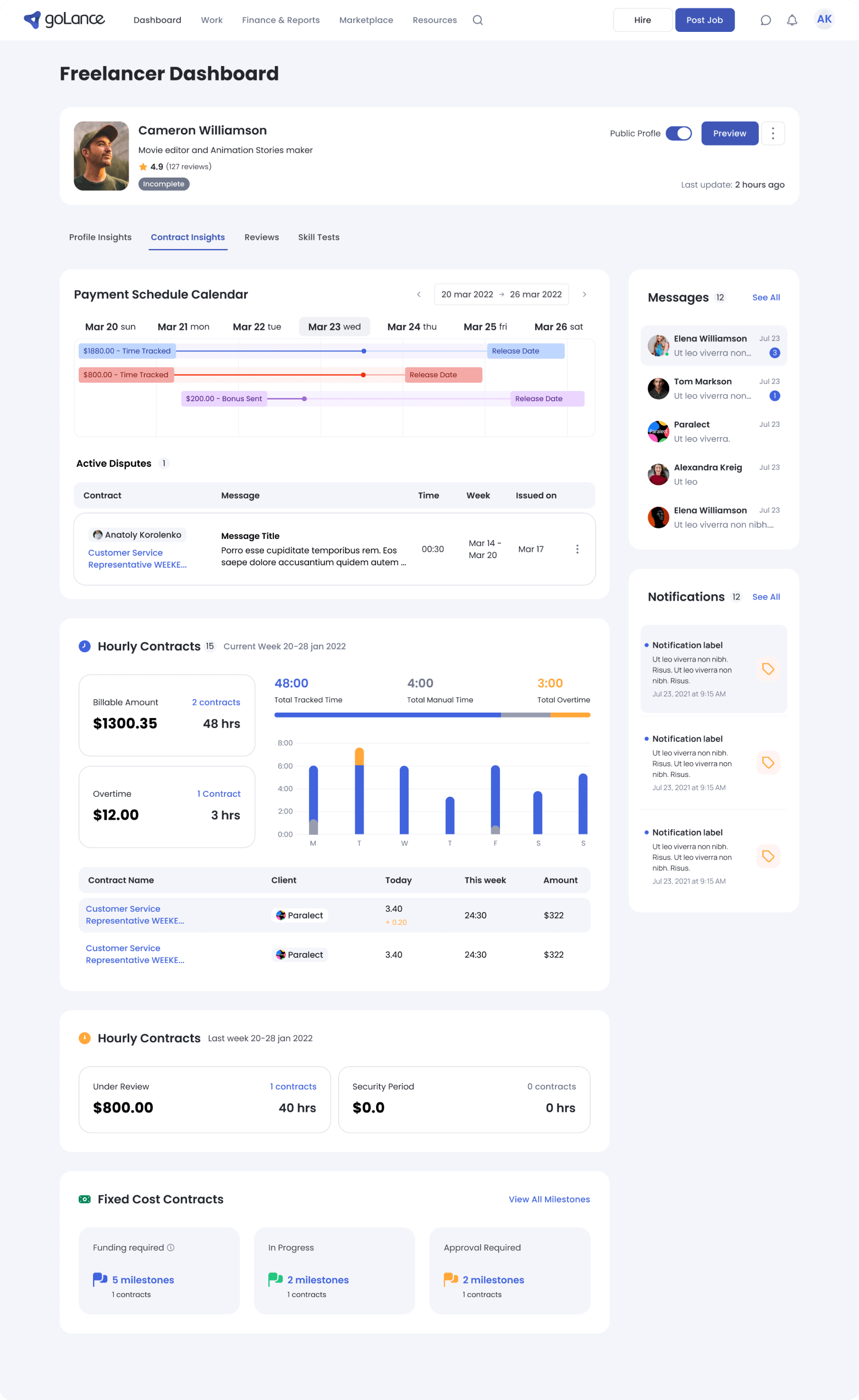
Freelancer Dashboard
The problem
01
The UX study revealed a number of problems in the operation of the site, for example, the Hourly Contracts section showed users a poor functionality of the site and did not reveal all the possibilities.
02
The study also showed that users have a need to communicate with customers and see notifications without leaving the page.
03
The metrics research showed that the page requires a complete restructuring and block prioritization.
Old design
(made by previous designer)
Bad UX
Outdated UI
Badly prioritized sections and poor functionality
Research
Expert Interviews
I employed a comprehensive and methodical methodology by engaging in interviews with representatives from diverse departments within the organization to gather valuable insights about the distinct requirements and concerns related to the Freelance page.
User Interviews
Based on valuable feedback from real users, it was revealed that our Freelance Dashboard page lacks convenience and functionality. Users expressed concerns about the poor prioritization of sections and the limited availability of analytics. This feedback highlights the need for improvements to enhance the user experience and provide more comprehensive data analysis on this page.
Users say
Oliver Abramson
Tutor
26 y.o.
There are a lot of blocks on the teacher's page that distract attention, it is not clear how and where to fill out the profile
Amanda Haar
Tutor
31 y.o.
It was difficult to figure out where and how to create a lesson, navigation on the site is not convenient
Michael Lettau
Tutor
45 y.o.
Instead of promoting my lesson cards, why do students see my news feed first? Useless UI...
Results of work
01
Research and gathering
I gathered and structured all user feedback from interviews, top management insights, and metrics data. Made CJM and personas cards to better understand our users.
02
Wireframing and design
I went through a thorough process for redesigning the UI and UX of a page, including collaborating with product managers, creating design layouts and a clickable prototype for usability testing.
03
Usability and final design
I conducted usability testing by recruiting 5 participants, preparing scenarios and questions for them, and using their feedback to make final changes to the design.
By the way
Usability testing is a great way to validate the usability of your design and make any necessary adjustments before the final launch.
Final Design
Placed accents
Clean and clear interface
Added the ability to receive your payments
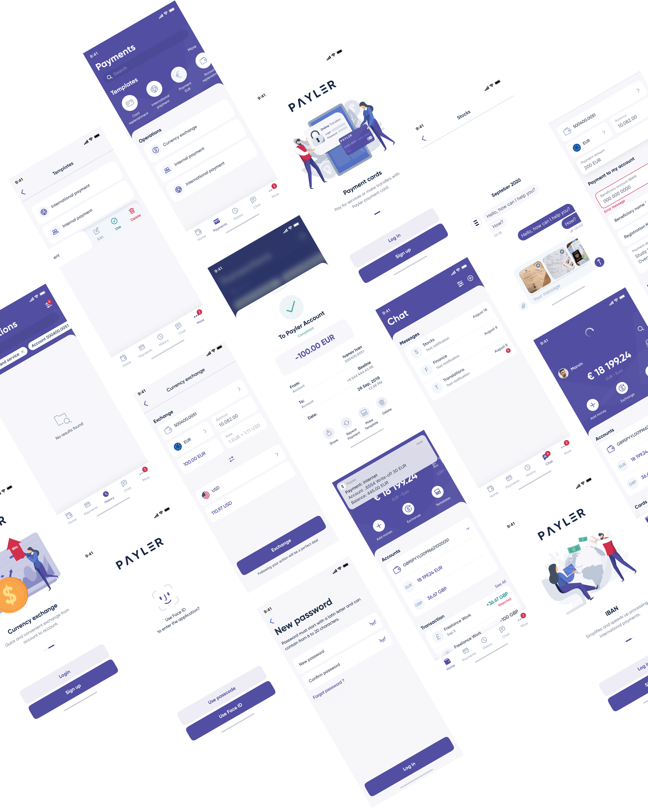
Overview
Payler – integrated finance operating hub for global digital businesses. Business banking and digital payments acceptance on one platform. Solutions built for a global business: platform accepts directors and shareholders from 190+ countries and supports payments in 40+ currencies.
– Simple treasury management with multi currency accounts and global payments;
– Global payments acceptance platform for pay-in and pay-out;
– Multi-currency operations: hold, convert, send and receive money in 30+ currencies;
– Multiple payment methods to 180+ countries;
Role & Duration
UX/UI Designer
Oct 2018 - Apr 2019
Team
– 1 Product Designers
– 2 UX/UI Designers
– 2 Product Managers
– Analytical Department
– Marketing Department
– 7 Developers
My role
As a UX/UI designer, I have been involved in all aspects of the product development process. My team had 2 UX/UI designers and one product designer.
In more details, I led the following projects:
01
Designing of the range of features from the scratch
02
Design System creation
03
Creation of marketing materials
Applied skills:
App
Usability testing
UX Research
Responsive Design
Wireframing
Prototyping
Design Thinking
User Interview
UX/UI
Below I will demonstrate a few of the screens I’ve been working on in Payler